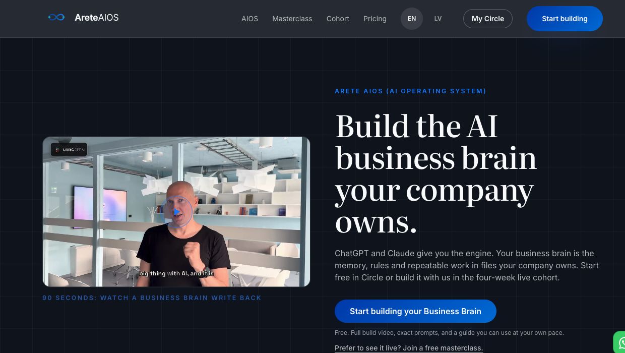
The official website
Dark surfaces, large Literata headings, numbered blue labels and the original mark. The live website is the reference for web layouts.
Open areteaios.comArete AIOS Brand Center
The shared reference for everyone creating Arete AIOS materials. Get the original logos, see the brand in practice and use the same design in websites, presentations, documents, social content and video.
Open to every partner. No sign-in required. Excluded from search indexing.
01 / How to use
Keep brand.areteaios.com as the reference. Send the same address whenever you start work with a partner.
Choose the example closest to your material, then use the rules and original files. The brief below works for every format.
Give the tool the ready-to-use brief. Full rules are in brand.md; logo URLs are in assets.json. If it cannot open links, download and attach these files.
02 / Brand in practice
See how the brand works in a real website, an editable presentation and a recorded video. Use the written rules below when a historical example differs.
Dark surfaces, large Literata headings, numbered blue labels and the original mark. The live website is the reference for web layouts.
Open areteaios.com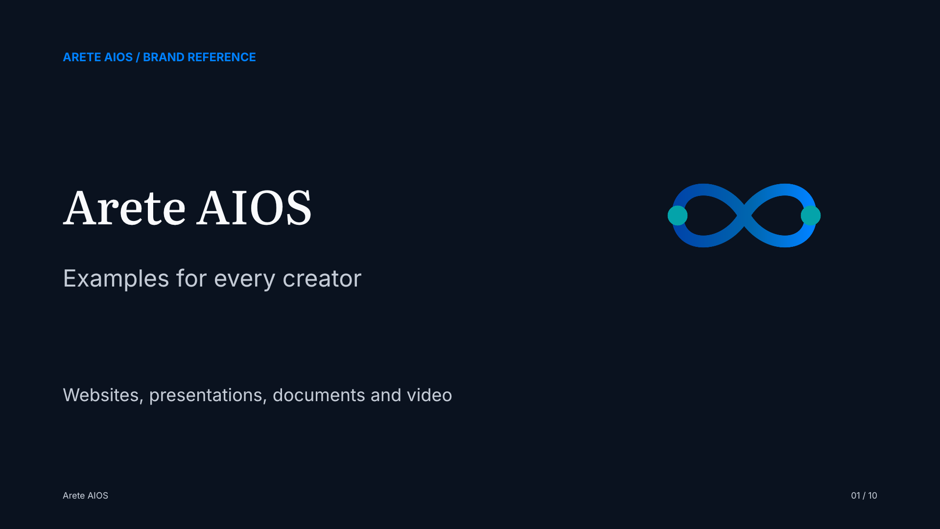
A reusable English example with ten layouts, the approved typography and original logos. Open the deck or adapt the editable PowerPoint.
View all 10 slides
An existing English walkthrough with Arete AIOS on screen. This unlisted recording predates the current typography rules. Follow this center for new video titles, captions and logo cards.
Watch on YouTube03 / Every material
Use the dark palette and supplied CSS tokens. Keep Literata for H1/H2, Inter for UI and numbered blue labels. Status colours carry a real state.
Use a dark 16:9 canvas, large text and one idea per slide. Download the ten-slide reference and keep sources and detail in the notes.
Keep the title hierarchy, exact typefaces and original logos. Use clear headings and roomy tables. Check the exported PDF at reading size and proof printed materials before production.
Adapt the layout to the destination's aspect ratio. Keep the dark background, a short Literata title and Inter text. Give the logo space and preview the final crop on a phone.
Use the original logo in opening and closing cards. Set titles in Literata and captions or lower thirds in Inter. Motion should explain the content. Check a still frame and the full playback.
Attach the rules and assets to the project. Keep the source meaning, credits and verified facts. A different format does not introduce a new colour palette or a replacement logo.
Check the original logo, approved colours and fonts, clear hierarchy and final export. Send the editable source with the finished file. Egils approves changes to the brand identity.
04 / Design principles
Arete AIOS websites, working interfaces and presentations use dark surfaces throughout. Use #0A121F for the background, near-white headings and a softer body-text colour.
Use #0081FF on dark surfaces. Blue belongs on links, numbered labels, icons and a few points of emphasis. Keep large backgrounds dark.
The blue gradient belongs only on primary action buttons and icon chips. Use the supplied gradient value. Keep page backgrounds and ordinary cards flat.
Literata is for large titles. Inter is for body text, navigation, buttons and numbers. JetBrains Mono is for terminals, code and live data.
Teal marks terminal prompts, completed checkmarks and one highlighted card. Keep numbers, prices and section labels blue. When in doubt, use blue.
05 / Colours
06 / Typography
The human voice.
Literata 500–600: H1 and H2 display titles only. Large and light; never weight 700.
The working voice: text, buttons, navigation and numbers.
Inter 400/600/700: everything else, including 01 / LABELS (600, 0.18em tracking, blue).
$ the machine voice_
JetBrains Mono: terminals, code and live data only. Never body text or marketing labels.
Use Literata for Latvian text too. Do not use Fraunces in this system. Inspect the exported file for ā, ē, ī, ū, č, ģ, ķ, ļ, ņ, š, ž, clipping and legibility.
| Element | Size at 1440px+ | Font |
|---|---|---|
| H1 / display | 76px · −0.02em · 1.02 | Literata 500 |
| H2 / section heading | 40px · −0.02em · 1.1 | Literata 600 |
| H3 / card heading | 18px | Inter 600 |
| Large number | 96px | Inter 700 |
| Body text | 17px · 1.6 · ≤68 characters per line | Inter 400 |
| Eyebrow "01 / LABEL" | 12.5px · uppercase · 0.18em · blue | Inter 600 |
| Terminal / data | 13–14px | JetBrains Mono 400 |
| Button | 16px | Inter 600 |
07 / Elements
Standard card
Dark background, a 1px white border at 10% opacity and 14px corners. Numbers and labels use blue, Inter 600.
Highlighted card
A teal border with a very subtle teal tint over the dark background. Use at most one per screen.
✓Teal can mark completed work
✓The colour carries a real meaning
Machine voice
A terminal uses the mono font and teal prompts. Keep the grid subtle.
08 / Presentations
1920 × 1080 px, 16:9. Use #0A121F on every slide, #F9FAFC for headings, #C4CBD6 for body text and #0081FF for emphasis.
01 / ONE IDEA
A clear title. One claim.
Room for an example and evidence.

| Slide element | Rule at 1920 × 1080 px |
|---|---|
| Title | Literata 500–600, 76–96 px |
| Subtitle | Inter, around 40 px |
| Body text | Inter, at least 34 px. Split the slide if it does not fit. |
| Source or disclaimer | 17–18 px; machine labels at least 20 px |
| Content | One main idea, at most 45 words. Details belong in speaker notes. |
| Logo and delivery | Use the original downloaded logo. Deliver editable source and PDF. |
09 / Logos
Arete AIOS symbol: the original infinity mark with two teal nodes. Use it in presentations and materials. SVG stays sharp at any size.
Arete AIOS with its name: the original PNG logo on a dark badge. Use it where both the mark and name are needed. Preserve the file's colours and proportions.
10 / Boundaries
--gradient-primary, glassmorphism or neon glow11 / Ready-to-use brief
Copy the full text below and add the material you need. To reuse the design in later work, save this brief in your project's persistent instructions.
Use the Arete AIOS brand for the material requested in this project and keep it consistent in future work.

Read https://brand.areteaios.com/brand.md and https://brand.areteaios.com/assets.json before creating anything. Use https://brand.areteaios.com/tokens.json for exact design values. Look at the examples at https://brand.areteaios.com/#examples and choose the one relevant to the format.

Use the original logo files from the asset manifest unchanged. Preserve their proportions and colours. Do not redraw, recolour, stretch or generate a substitute logo.

Use the approved dark palette: #0A121F background, #F9FAFC headings, #C4CBD6 body text and #0081FF emphasis. Literata 500–600 is for display titles, Inter is for body text and UI, and JetBrains Mono is only for code, terminals or data. Keep roomy spacing and a clear hierarchy.

Apply these rules to websites, presentations, documents, social content and video. Adapt the layout to the requested medium and aspect ratio. For slides, use 16:9 at 1920 × 1080 px, body text at least 34 px, one main idea and no more than 45 words per slide. For video, keep opening and closing cards, captions and lower thirds within the same brand.

Preserve the source material's meaning, language, author credits and verified facts. Avoid purple styling, decorative gradients, card shadows, emoji headings and decorative motion. Do not invent claims, prices, endorsements or new brand assets.

Inspect the final material in its actual delivery format for readability, clipping, missing assets and Latvian characters. Deliver the editable source with the final export. Ask Egils before changing the brand identity.

Save these instructions as project knowledge or persistent instructions when supported. If you cannot fetch the guide or assets, ask me to attach brand.md, assets.json and the logo files. Do not guess the brand. The backup is https://wisdomblend-eb-brand.pages.dev/ with the same file paths.
You can also select and copy the text yourself.